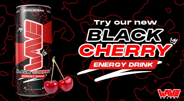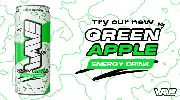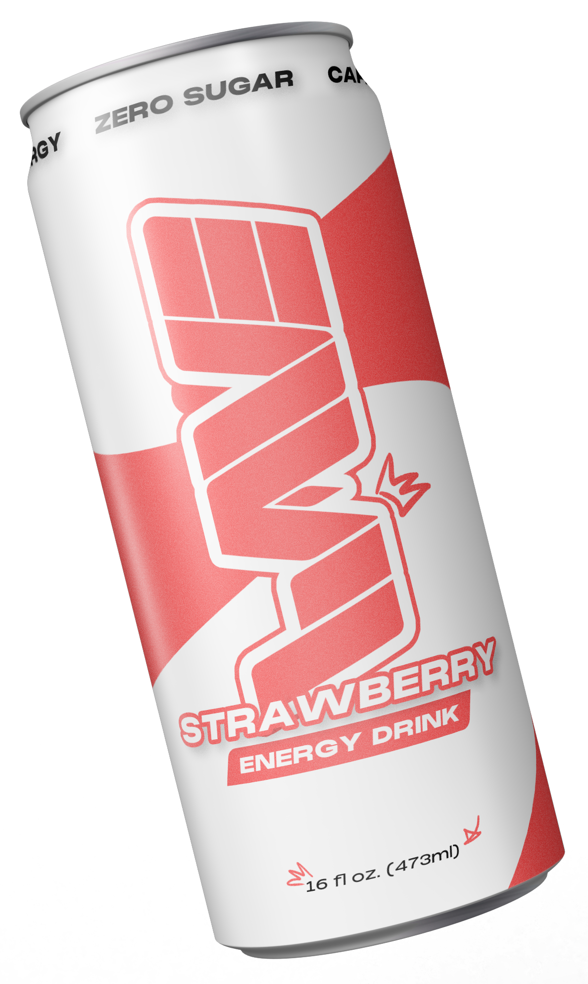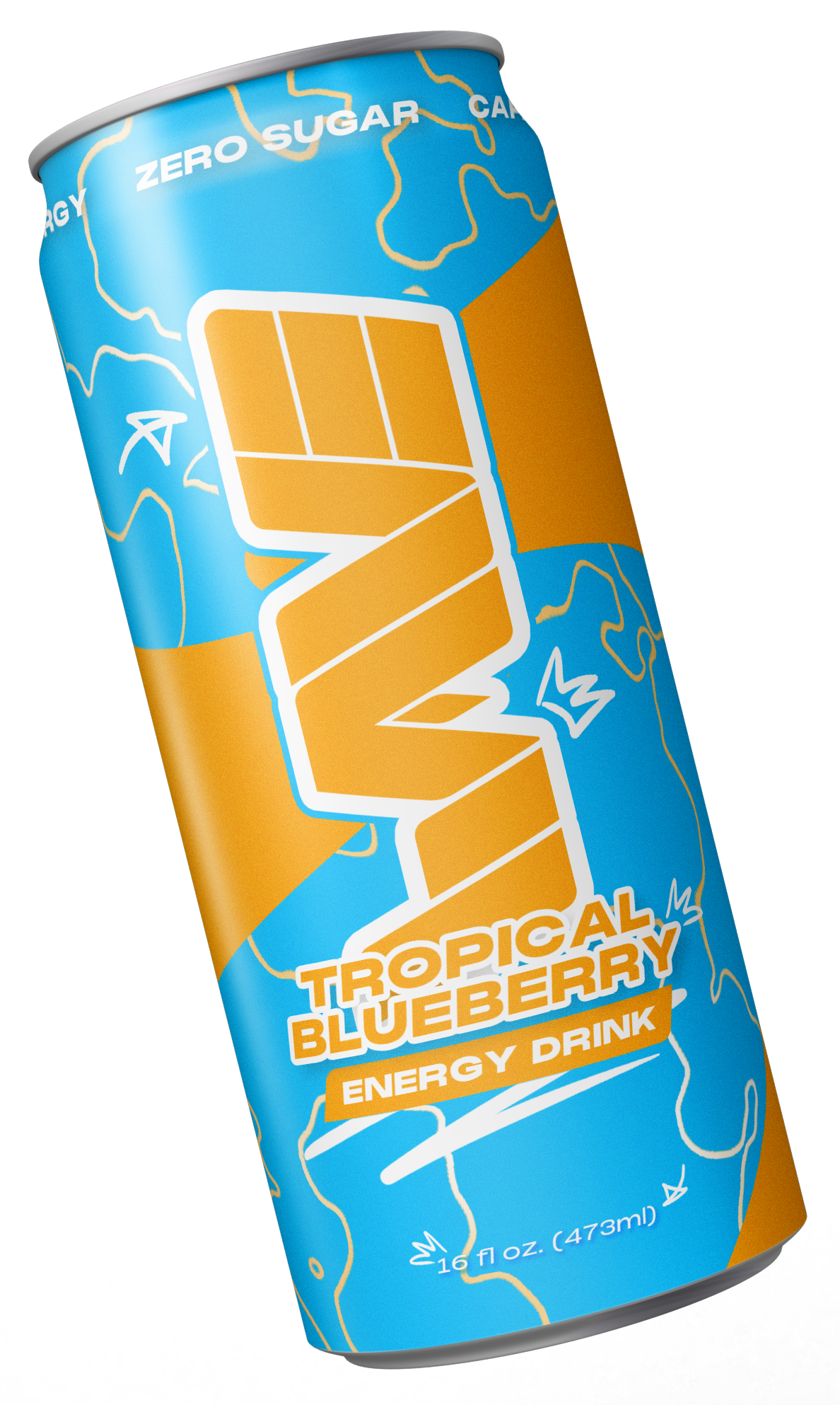
Energy drinks & their brands always position themselves as drinks for the "hardcore" individual. Wave strives to position themselves in a similar way, but for the more general fan. Wave Energy surfed on to the market half a decade ago w/ the promise to be a healthier alternative to all of those other sugary energy drinks.
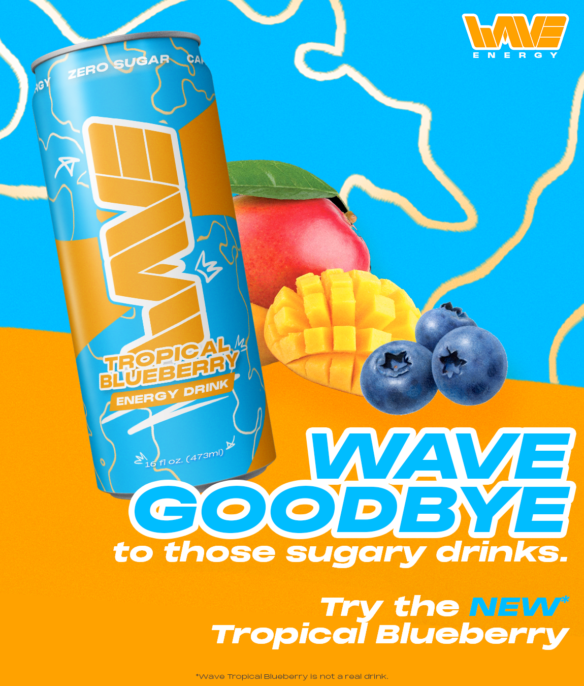
Wave aims to give you the same rush of energy those other drinks will give you with out the intense crash afterwards. We intend to keep you from wiping out while running on fumes.
We are energy. We're that rush you feel when the powder hits just right, or when you clutch up a 5v1, and you're the 1. Everything we do has a purpose. Backed by professional athletes to the zamboni driver at your local ice rink and everything in-between, we're the top choice for those that need an extra kick to keep them pushing through their day.
The goal of this project was to create a bright, vibrant brand identity for an energy drink that differs from the oh so common 'black background with an eye-catching logo and vibrant colours' that you see with brands like Monster and the old Rockstar, as well as some others like Reign and Bang.
To their defense, those brands are also very heavily involved in communities like competitive gaming, extreme sports, etc. which almost exclusively means that this strong, over-zealous branding works in their favor.
I wanted to take a different approach. I'm neither an extreme athelete (skateboarder, bmx rider, snowboarder, etc.) or a competitive gamer, in fact I haven't played competitive games in over half a decade at this point. I play story driven games, read novels and comics, make art, listen to and write music and part-take in some of the nerdiest hobbies you can imagine, so the question became less "how do we make this stand out?" and became more "how can we make this feel as inclusive as possible, without trying to take the others down a peg?"
The original concept (pictured below; left) was not too dissimilar to the final result we have today, however, there were elements lacking that upon their introduction, tied the rest of the project together seamlessly. The original concept was less involved than it is now, barring the logo which hasn't changed since the beginning of the process, though I guess you can call it more of a wordmark.
Original Marketing Concept
Original Green Apple & Watermelon Cans
At the beginning of the process, the primary goal was to ensure that colour was one of the main focuses of the brand, and to use it generously. With this in mind, it became hard to pick a default colour scheme for the wordmark as well as generic promotion and marketing materials as each flavoured can was going to feature a colour scheme that was directly related to that particular flavour, for example Green Apple or Watermelon (pictured above; right).
With this in mind, I settled on not featuring a set default colour scheme and instead using product specific individualized colour schemes depending on the products featured (in this case, cans featured in marketing materials).
With regards to imagery and iconography, images & photos were never the main focus of the brand. There were some experiments done early on, but those files have since been scrapped, however the remnants of those experiments can be seen in the following image from another brand I was designing before it became 'Wave Energy'.
Drift Energy concept w/ photo. Drift eventually became 'Wave Energy'. I may develop it as it's own brand, but that has yet to be seen.
During the ideation process, the solution I settled on originally was a circular, vortex-shaped wave (pictured right) to give the cans and marketing material some direction. Add movement to the visuals, if you will. This worked for a while, and I was content with it until a handful of months ago where something seemed as though it was missing. It looks very empty, which a lot of the time is not an issue. Less is more, etc. but for an energy drink, there seems to be a serious lack of energy in the visual language that surrounds this brand.
During the ideation process, the solution I settled on originally was a circular, vortex-shaped wave (pictured below) to give the cans and marketing material some direction. Add movement to the visuals, if you will. This worked for a while, and I was content with it until a handful of months ago where something seemed as though it was missing. It looks very empty, which a lot of the time is not an issue. Less is more, etc. but for an energy drink, there seems to be a serious lack of energy in the visual language that surrounds this brand.
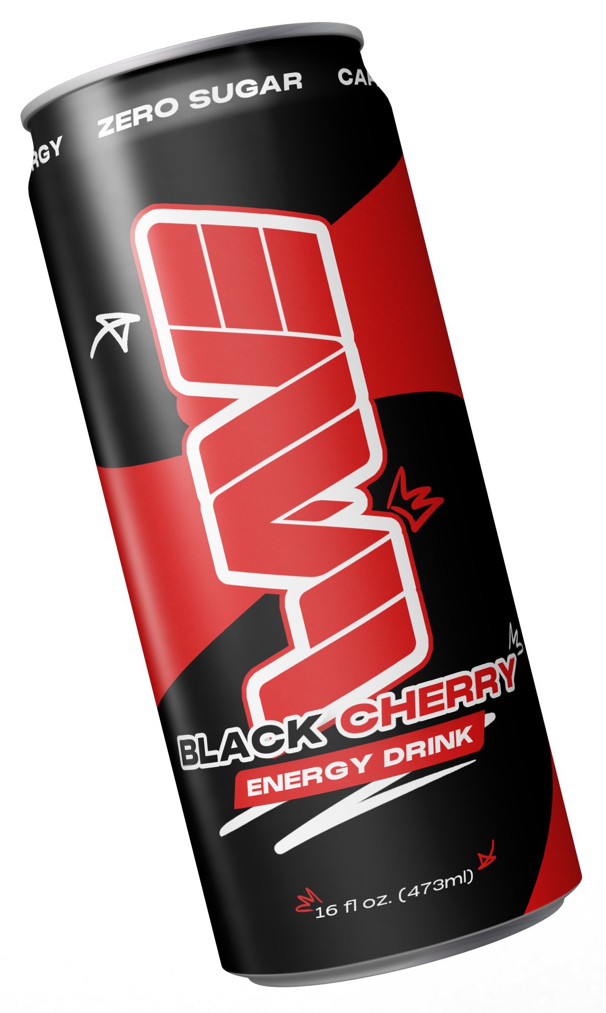
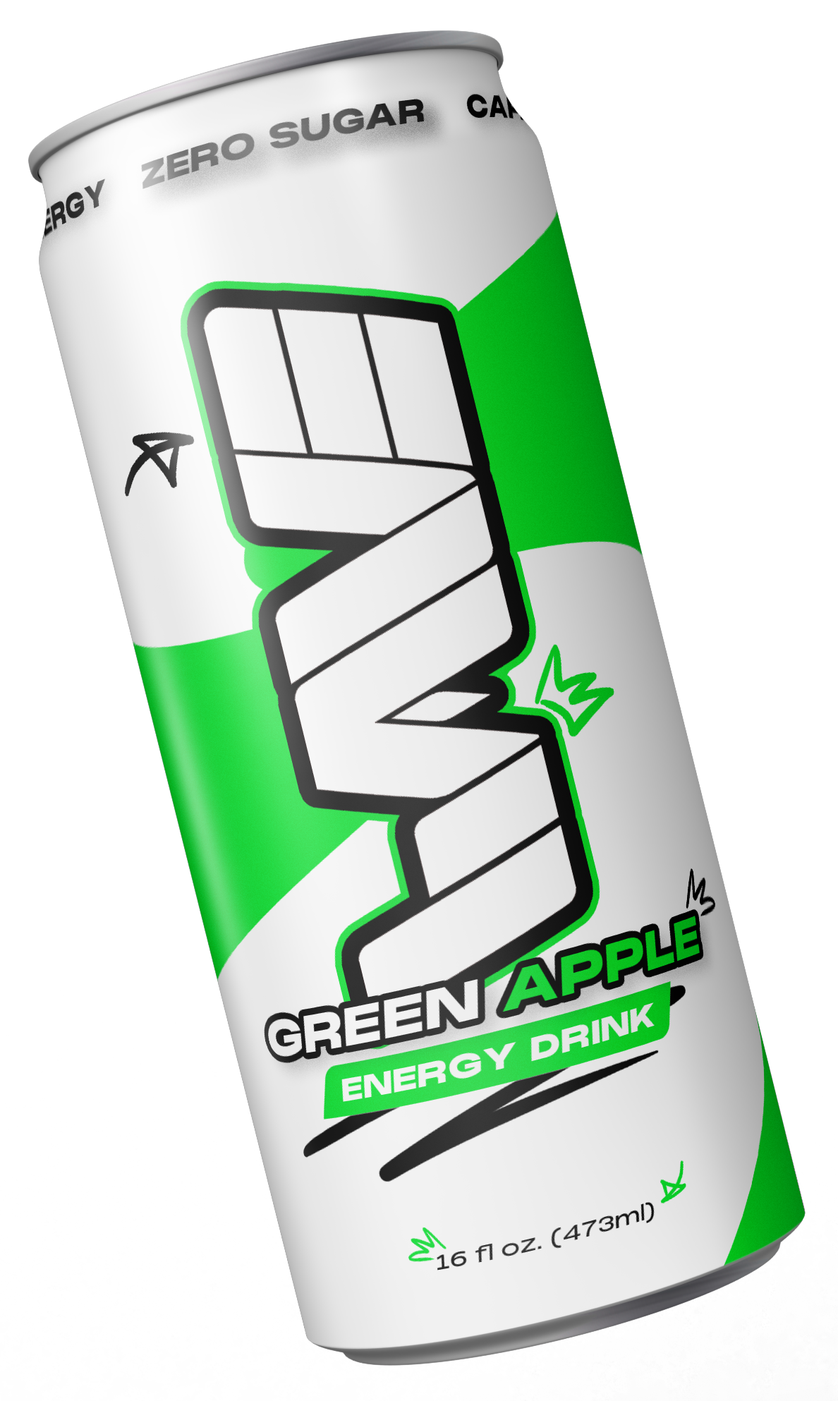
In light of this new revelation, I decided to incorporate hand-drawn graphics and icons to lean more into the fun, inclusive look of the brand, where once again, I was content, and was finally happy with where it was headed.
Not for a lack of feeling content, I decided to make one final change to the look. Texture. The whole visual identity lacked texture. This is neither a positive or a negative, but it's something that began to feel extremely noticable and unavoidable as the amount of white space, even with the newly added graphic elements, still felt a little too bare.
Instead of keeping the secondary colour on every can void of texture, the solution became to incorporate what I like to call 'radial waves'. Swirling, curving lines, that mimic a topographic map. These waves not only give texture to the overall look and feel, but they lean more heavily into the brand identity, and act as an unobtrusive pattern that can be replicated and used across different marketing and promotional materials.